Examples of Graphical Mediocrity and Excellence
For an example of a mediocre graphic, I found and chose this one to demonstrate what I believe to be a below average graphic that depicts some key flaws in its graphical representations of the data it presents. According to Tufte's standards of graphical excellence, and the standards widely accepted, this graphic suffers mainly because of these prominent issues:
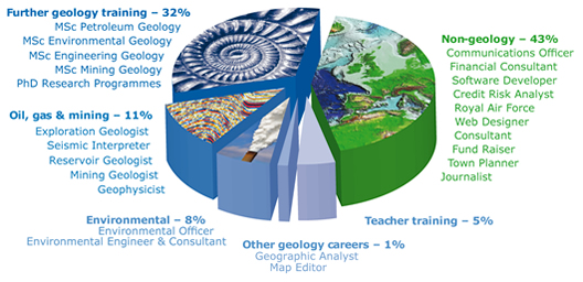
- unnecessary use of 3-D graphic effect
- data-ink maximization ratio is too great, would be fine without images on chart
- color scheme is not varied enough to separate data, results in having to pull chart into floating pieces
- sections of chart are not clearly matched with their respective data, difficult to quickly decipher
For these main reasons, I believe this to be a usable but ultimately underdeveloped graphic for what it is trying to portray. Thus I am rating it a mediocre graphic.
For an example of graphical excellence, I chose this graphic to represent what I believe to be a very well executed depiction of the data being presented. Basing this rating on Tufte's standards of graphical excellence and typical widely accepted standards, this graphic excels mainly because of these well portrayed features:
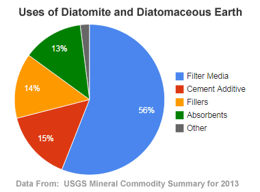
- simple 2-dimensional pie chart, no unnecessary variation
- data-ink maximization ratio is well executed, no overuse
- color scheme is well varied, clearly depicted separate data
- data with matching legend is clear and easy to understand, to the point
As one can see, this graphic is a great representation of graphical excellence due to its simplicity, clarity, and effectiveness. It is a perfect example of keeping things straight to the point.
Summary of Edward Tufte's PowerPoint Paper
In The Cognitive Style of PowerPoint, Edward Tufte discusses the negative aspects of utilizing PowerPoint as a means of presenting info in a professional or formal environment. He begins by discussing the psychology of both the presenter and the audience when PowerPoint is being used to present the information they are attempting to report. The audience is subject to slide after slide of info they can read 3 times as fast as the presenter can discuss it, and it ends up hurting nearly 80% of presenters. As he discusses, 20% of people have the skill to present over the style or are simply just great with it, and thus have no fault when using this program, but a majority of presentations are hurt when falling prey to the PP (PowerPoint abbreviation) style. Tufte then moves on to discussing the PP slide formatting, and the obnoxious use of transitions and other stylistic features. As mentioned in the paper, a series of experiments showed that people had a difficult time remembering multitudes of random data, thus creating a "Magic Number 7", rule for PP slides. The issue mentioned though, is that those that are being fed this info get countless slides containing seven things, adding up to way too much useless data. Tufte goes on about data representations, and general misuse of reporting using this program, so he explains how schools and professional environments should be recovering from using this program and simply presenting the audience with fully written reports, and addressing the topics more directly and allowing the audience to dictate for themselves how they want to receive and comprehend the information. Personally, I connected with the psychological aspects of using PP, and how it alters the presenter's approach and the audience's reception. As a presenter, I feel guided by the slides as opposed to the other way around, which is completely backwards in my opinion. As an audience member, I have yet to find a single PP presentation engaging, no matter how many video clips or interesting graphics they include. Each one simply feels like a grind and regurgitation of info we could read and understand on our own time. For those reasons, I agree with Tufte and his disdain for PowerPoint presentations.
(Ref. The Cognitive Style of PowerPoint by Edward Tufte)